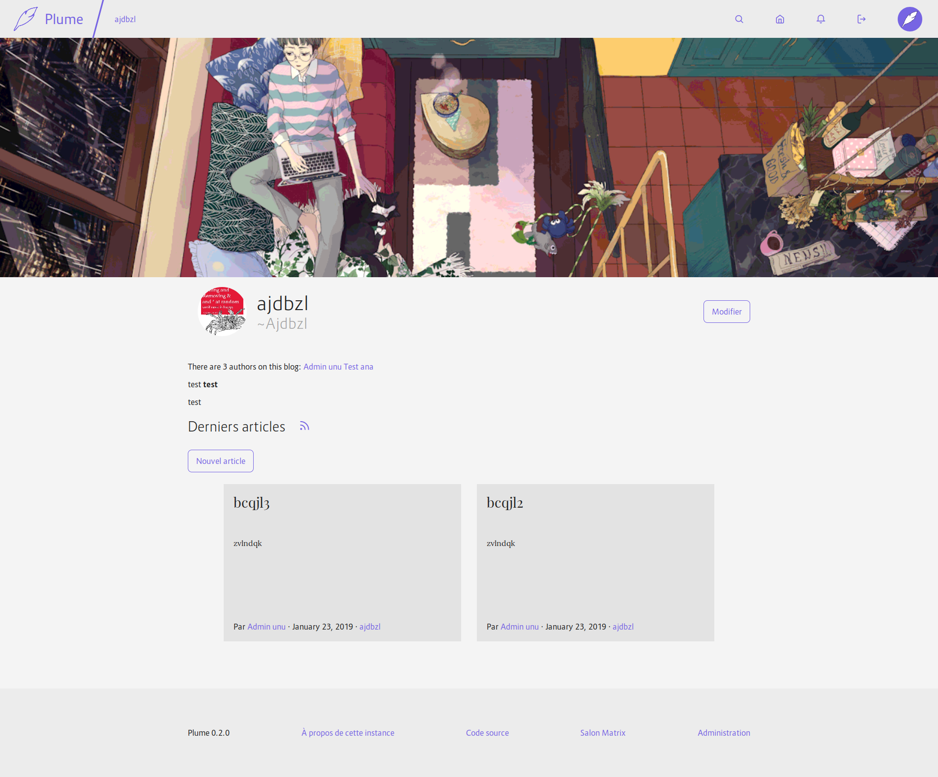
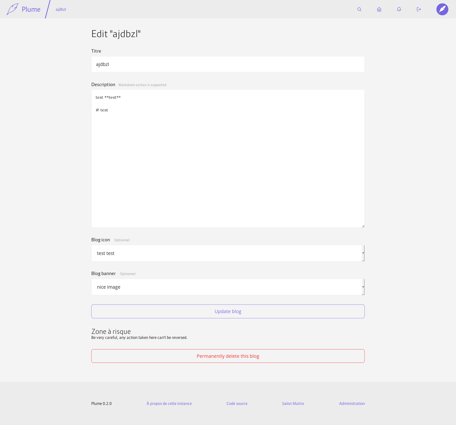
* Start to update the theme

- Ligther colors
- No more border radius
- Buttons are now always colored
- Start to redesign the post page (according to the Figma mockups)

* Fix build script: it now recompiles everytime a scss file changed

* Make sure the article illustrations are not too big

* Make articles wider (70 characters)

* Better contrast between gray shades

* Various improvements

* Better mobile style

* New style for the footer

* Improve comment style

* Better responsiveness again

* Limit the size of the article cover

* Last details?

- Improve buttons on the media page
- Improve lists

* Pin the stdweb version that we use

It changed because I removed Cargo.lock to handle a merge conflict

I could have updated cargo web too, but it mean I should have re-built
the CI docker image and it was taking forever.

* Better contrast for links in the header of the article

* Add a basic privacy policy

* Remove "also"

* Fix a few issues

- Don't watch static/css in build.rs
- Another shade of white
- Remove useless margin rule for error messages
Also adds a parameter to `md_to_html` to only render inline elements (so that we don't have titles or images in blog descriptions). And moves the delete button for the blog on the edition page.
I still have to update the SQLite migration once others PRs with migrations will be merged.
Also, there will be a problem when you edit a blog while not owning its banner or icon: when validating they will be reset to their default values… I don't see a good solution to this until we have a better way to handle uploads with Rocket (the same is probably happening for articles btw).
And the icon/banner are not federated yet, I don't know if I should add it to this PR or if it can come after?


Fixes#453Fixes#454
* Slightly improve the media experience
- Use a grid to display the list of media
- Add icons for non-image media preview
- Paginate the gallery
- Add links to the gallery in the editor and in the profile settings to make it more discoverable when you need it
Fixes#432
* Allow video and audio tags in SafeString
Otherwise we can't display their preview, nor show them in articles
Also show controls by default for these two elements
* Show fallback images for audio and unknown files, to make them more visible
* Add a new constructor to SafeString when the input is trusted and doesn't need to be escaped.
And use it to generate media previews.
* Make it possible to insert video/audio in articles
* Better contrat for input fields

This change set a white background for input field (text, select and textarea)
to have a better contrast with the page background and improve accessibility for
people with vision problem, and just crappy screen.

This change also remove the round corner for the input to have a clear difference
between editing field and buttons.

This max-width of the form element are a bit bigger too.

* Less space between label and input
This change also remote all units for line-height to have more consistent styles and better cascading support. This solve the too small line height for multi line header in article and also add styling for h1 to h6 (previously h3 to h6 was not styled at all)