* Add a way to display flash messages

* Make the flash messages look nice

* Add actual feedback messages

* cargo fmt

* Move flash messages to PlumeRocket

And add trait to convert PlumeRocket to BaseContext

* Remove useless lifetime
Add support for remote interaction ([this thing](https://eldritch.cafe/users/Barmaid/remote_follow) in mastodon)

- [x] create the endpoint dispatching remote interactions to local pages
- [x] add this endpoint to web-finger
- [x] propose remote interaction when following and not connected
- [x] propose remote interaction when liking/sharing and not connected
- [x] propose remote interaction when commenting and not connected
- [x] fetch posts/comments we don't know but remote interaction was requested for ?
For devices that have a screen size so small they have to use the `max-width` property in CSS, the standard of a screen-size that has to be used here is `phones 600px and smaller`, not `900px`, which would have to use the `min-width` property instead, that would mean a widescreen size, because `min-width` means `a screen size of 900px, or more`, including desktops.
- Make it possible to insert new paragraphs in the article body
- Make it impossible to copy formatted HTML (to make media insertion from markdown code work correctly)

TODO:

- [x] make it possible to escape draft mode
- [x] display errors from the server
- [x] button to go back to the "normal" editor
- [x] Avoid publishing placeholders
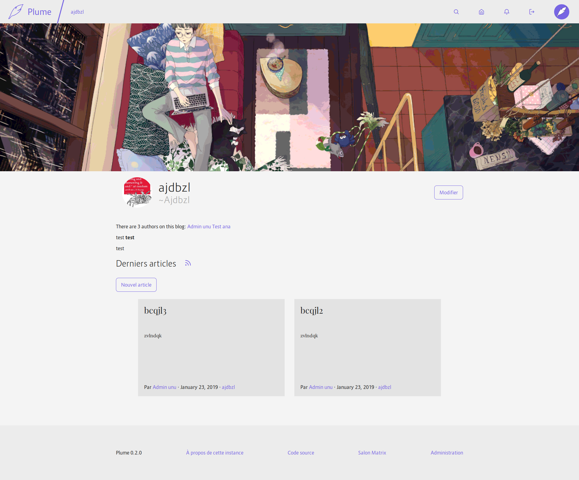
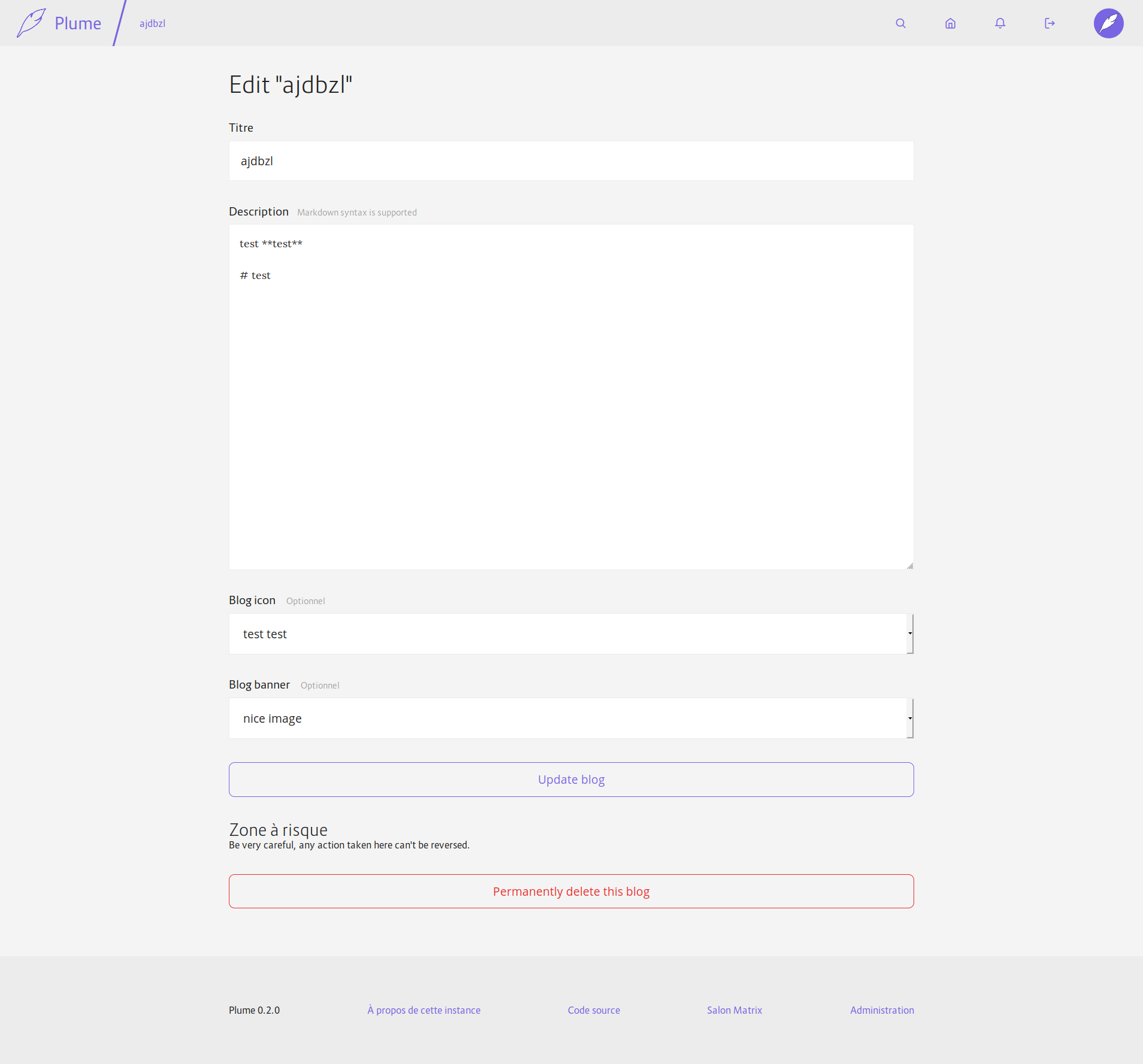
Also adds a parameter to `md_to_html` to only render inline elements (so that we don't have titles or images in blog descriptions). And moves the delete button for the blog on the edition page.
I still have to update the SQLite migration once others PRs with migrations will be merged.
Also, there will be a problem when you edit a blog while not owning its banner or icon: when validating they will be reset to their default values… I don't see a good solution to this until we have a better way to handle uploads with Rocket (the same is probably happening for articles btw).
And the icon/banner are not federated yet, I don't know if I should add it to this PR or if it can come after?


Fixes#453Fixes#454
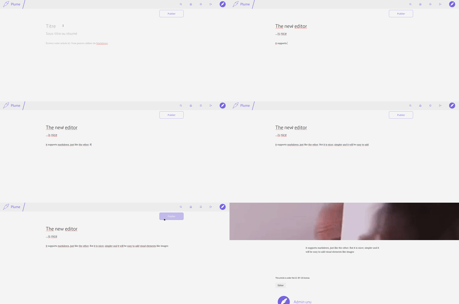
With this PR, when JS is activated and WASM supported, the article editor will be dynamically replaced with `contenteditable`s elements. This makes the editing interface simpler and less like a regular form. It will also allow us to easily add visual formatting with native browser APIs (and to insert images or videos directly). Here is a little demo:

There is still a lot to do, but it is a good first step.
Fixes#255
* Slightly improve the media experience
- Use a grid to display the list of media
- Add icons for non-image media preview
- Paginate the gallery
- Add links to the gallery in the editor and in the profile settings to make it more discoverable when you need it
Fixes#432
* Allow video and audio tags in SafeString
Otherwise we can't display their preview, nor show them in articles
Also show controls by default for these two elements
* Show fallback images for audio and unknown files, to make them more visible
* Add a new constructor to SafeString when the input is trusted and doesn't need to be escaped.
And use it to generate media previews.
* Make it possible to insert video/audio in articles
* Better contrat for input fields

This change set a white background for input field (text, select and textarea)
to have a better contrast with the page background and improve accessibility for
people with vision problem, and just crappy screen.

This change also remove the round corner for the input to have a clear difference
between editing field and buttons.

This max-width of the form element are a bit bigger too.

* Less space between label and input
This change also remote all units for line-height to have more consistent styles and better cascading support. This solve the too small line height for multi line header in article and also add styling for h1 to h6 (previously h3 to h6 was not styled at all)
All the template are now compiled at compile-time with the `ructe` crate.
I preferred to use it instead of askama because it allows more complex Rust expressions, where askama only supports a small subset of expressions and doesn't allow them everywhere (for instance, `{{ macro!() | filter }}` would result in a parsing error).
The diff is quite huge, but there is normally no changes in functionality.
Fixes#161 and unblocks #110 and #273
GET routes are not protected against CSRF. This commit changes the needed URLs to
POST and replace simple links with forms.

Thanks @fdb-hiroshima for noticing it!
Removing outline without adding other indicators for focused content is an accessibility violation (try using Tab to navigate on the page - you can't tell where the focus is).

http://www.outlinenone.com/